Logo
Buying Guides
9 min read
Ning Ma

How to Choose Art That Feels Like a Window, Not a Decoration

The best art doesn't just decorate—it transports. Learn how to choose art that feels like a window to another place, creating connection and escape rather than just filling space.

#window art#transportive art#realistic art#art selection#interior design#home decor
How to Choose Art That Feels Like a Window, Not a Decoration

How to Choose Art That Feels Like a Window, Not a Decoration

How to Choose Art That Feels Like a Window, Not a Decoration

Most art decorates. The best art transports. It feels like a window to another place—a connection, an escape, a view. Here's how to choose art that feels like a window, not just decoration.

The Difference

Decoration vs. Window

Decoration:

  • Fills space
  • Matches decor
  • Looks nice
  • Serves function
  • Stays on wall

Window:

  • Opens space
  • Transports you
  • Creates connection
  • Feels alive
  • Takes you somewhere

The difference: Decoration is passive. Window is active. Window creates experience.

Why Windows Matter

Windows in art:

  • Create sense of escape
  • Provide mental rest
  • Connect to nature
  • Offer visual journey
  • Transform space emotionally

The effect: Art becomes portal, not just picture.

Characteristics of "Window" Art

Realistic Representation

What it is: Art that looks like real place, real moment, real view

Why it works:

  • Feels authentic
  • Creates believability
  • Suggests real location
  • Feels like actual view
  • Promotes connection

Best examples:

  • Photographic realism
  • Detailed landscapes
  • Realistic scenes
  • Authentic moments
  • True-to-life representation

The rule: More realistic = more like window.

Depth and Perspective

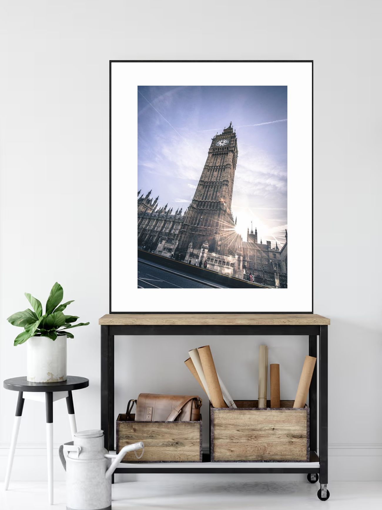
This award-winning piece from Asia demonstrates depth and perspective—the grand forest scene with natural depth creates three-dimensional quality that feels like looking through a window.

What it is: Scenes that show distance, depth, receding elements

Why it works:

  • Creates illusion of space
  • Draws eye into distance
  • Feels like looking through
  • Suggests world beyond
  • Creates sense of escape

Best examples:

  • Receding horizons
  • Distant mountains
  • Vanishing points
  • Atmospheric perspective
  • Scenes that pull you in

The rule: More depth = more like window.

Natural Light

This award-winning piece from North America demonstrates natural light—the night sky scene with natural illumination creates realistic window-like quality with authentic lighting.

What it is: Realistic lighting, natural illumination, authentic light

Why it works:

  • Feels like real moment
  • Creates believability
  • Suggests actual time
  • Feels authentic
  • Promotes connection

Best examples:

  • Natural daylight
  • Realistic shadows
  • Authentic illumination
  • True-to-life lighting
  • Natural light quality

The rule: Natural light = realistic window.

Scale and Presence

What it is: Large enough to feel immersive, not just decorative

Why it works:

  • Creates presence
  • Feels immersive
  • Commands attention
  • Suggests real view
  • Promotes connection

Best examples:

  • Large pieces (50-80% of wall)
  • Immersive scale
  • Commanding presence
  • Focal point size
  • Window-like dimensions

The rule: Larger = more immersive = more like window.

Connection to Nature

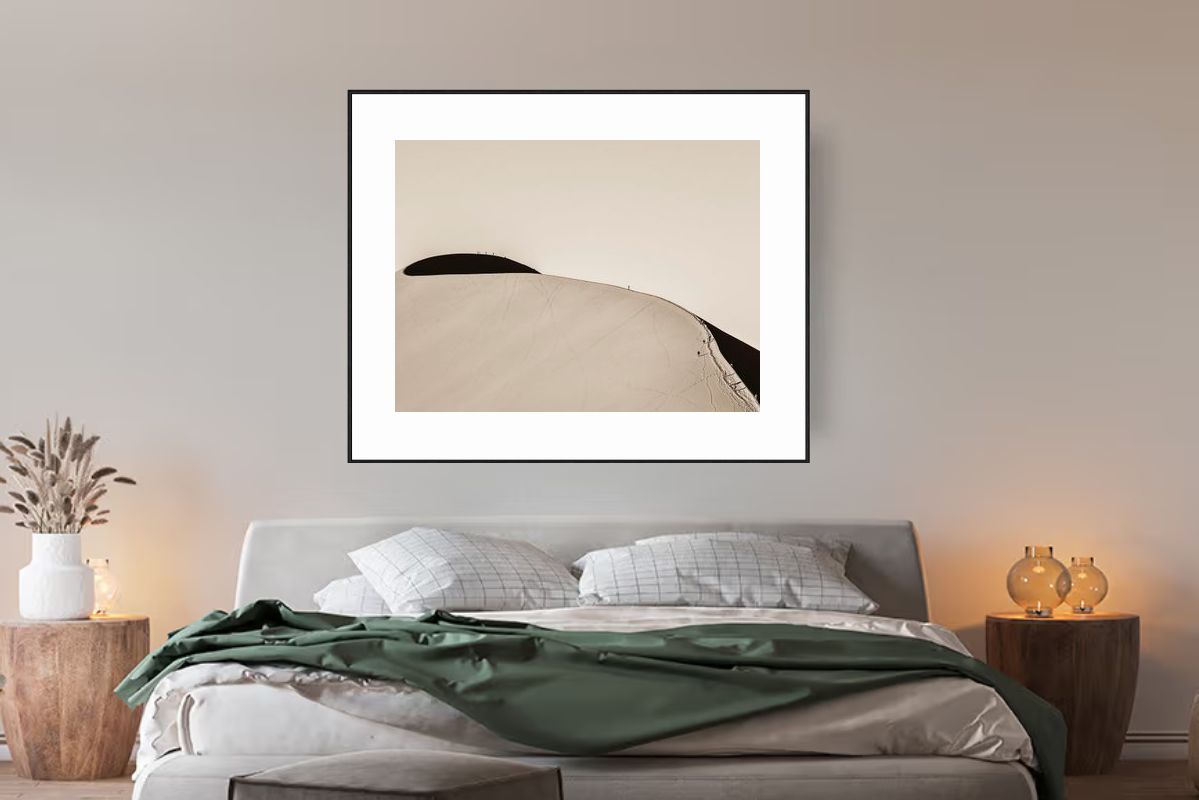
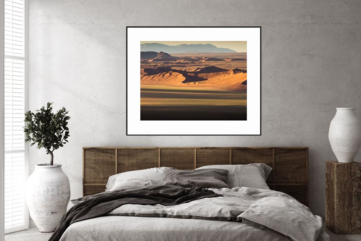
What it is: Real nature scenes, authentic landscapes, true places

Why it works:

  • Feels real
  • Creates connection
  • Suggests actual location
  • Promotes escape
  • Feels authentic

Best examples:

  • Real landscapes
  • Authentic nature
  • True locations
  • Realistic scenes
  • Natural beauty

The rule: Real nature = real window.

What Makes Art Feel Decorative

Overly Stylized

Why it feels decorative:

  • Looks artificial
  • Doesn't feel real
  • Suggests design, not place
  • Lacks authenticity
  • Feels manufactured

Avoid: Heavy stylization, artificial looks, design-focused art.

Flat, No Depth

Why it feels decorative:

  • No sense of space
  • Doesn't draw you in
  • Feels like surface
  • Lacks dimension
  • Stays on wall

Avoid: Flat compositions, no perspective, surface-only art.

Abstract or Non-Representational

Why it feels decorative:

  • Doesn't represent place
  • No connection to location
  • Feels like design
  • Lacks narrative
  • Stays decorative

Note: Abstract can be beautiful, but it's decoration, not window.

Too Small

Why it feels decorative:

  • Doesn't command attention
  • Gets lost on wall
  • Lacks presence
  • Feels like accessory
  • Doesn't transport

Avoid: Art that's too small to be immersive.

Artificial Colors

Why it feels decorative:

  • Doesn't look real
  • Feels manipulated
  • Lacks authenticity
  • Suggests design
  • Doesn't feel natural

Avoid: Over-saturated, artificial, manipulated colors.

Choosing "Window" Art

Step 1: Look for Realism

Check for:

  • Realistic representation
  • Authentic details
  • True-to-life scenes
  • Photographic quality
  • Believable moments

The more realistic, the more like window.

Step 2: Look for Depth

Check for:

  • Perspective and distance
  • Receding elements
  • Vanishing points
  • Atmospheric depth
  • Scenes that pull you in

The more depth, the more like window.

Step 3: Look for Natural Light

Check for:

  • Realistic lighting
  • Natural illumination
  • Authentic shadows
  • True-to-life light
  • Natural light quality

The more natural light, the more like window.

Step 4: Choose Appropriate Size

For window effect:

  • Go large: 50-80% of wall width
  • Create presence: Large enough to be immersive
  • Command attention: Focal point size
  • Feel like view: Window-like dimensions

Why: Large art feels more like window than decoration.

Step 5: Choose Real Nature

Best subjects:

  • Real landscapes
  • Authentic nature scenes
  • True locations
  • Realistic representations
  • Natural beauty

Why: Real nature creates real connection.

Real Examples

Example 1: Living Room Window

Art: Large realistic landscape (72 inches wide)

  • Photographic realism
  • Receding horizon
  • Natural daylight
  • Real landscape
  • Immersive scale

Effect: Feels like window to landscape, not decoration.

Example 2: Bedroom Window

Art: Large calm water scene (60 inches wide)

  • Realistic water
  • Depth and distance
  • Natural light
  • Authentic scene
  • Immersive presence

Effect: Feels like window to peaceful place, transports you.

Example 3: Office Window

Art: Large mountain vista (54 inches wide)

  • Realistic mountains
  • Atmospheric perspective
  • Natural illumination
  • True landscape
  • Commanding scale

Effect: Feels like window to inspiring place, creates escape.

Creating the Window Effect

Placement

For window effect:

  • Eye level (57-60 inches)
  • Centered on wall
  • Good lighting (enhances realism)
  • Breathing room (feels like frame)
  • Prominent position (focal point)

Result: Art feels like window, not decoration.

Lighting

For window effect:

  • Natural light if possible
  • Good artificial lighting
  • Highlights art properly
  • Enhances realism
  • Creates depth

Result: Proper lighting makes art feel more like window.

Framing

For window effect:

  • Simple frames (don't distract)
  • Or frameless (clean, modern)
  • Let art be focus
  • Frame like window
  • Minimal distraction

Result: Framing supports window effect.

Surrounding Space

For window effect:

  • Minimal competing elements
  • Let art be focus
  • Clean, uncluttered
  • Art is star
  • Space supports art

Result: Space enhances window effect.

Common Questions

"Does It Have to Be Photographic?"

Answer: Not necessarily, but realistic representation helps. The more realistic, the more like window. But artistic interpretation can still feel like window if it has depth, natural light, and connection to real place.

"What About Abstract Art?"

Answer: Abstract art can be beautiful, but it's decoration, not window. Windows show places. Abstract shows design. Both have value, but different purposes.

"How Big Is Big Enough?"

Answer: 50-80% of wall width for walls, 60-75% for furniture. Large enough to be immersive, not just decorative. Size matters for window effect.

"Does Color Matter?"

Answer: Yes. Natural, realistic colors feel like window. Artificial, manipulated colors feel decorative. Authentic color = authentic window.

The Bottom Line

Art that feels like window:

  • Is realistic: Looks like real place, real moment
  • Has depth: Perspective, distance, receding elements
  • Uses natural light: Realistic illumination, authentic light
  • Is large enough: 50-80% of wall, immersive scale
  • Shows real nature: Authentic landscapes, true places
  • Creates connection: Feels like actual view, real location

Art that feels decorative:

  • Overly stylized (artificial, designed)
  • Flat, no depth (surface only)
  • Abstract (no place connection)
  • Too small (lacks presence)
  • Artificial colors (manipulated, unreal)

How to choose:

  1. Look for realism (authentic, believable)
  2. Look for depth (perspective, distance)
  3. Look for natural light (realistic illumination)
  4. Choose large size (50-80% of wall)
  5. Choose real nature (authentic landscapes)

Remember: The best art doesn't just decorate—it transports. It feels like a window to another place, creating connection and escape. Choose realistic, deep, naturally lit, large, authentic nature scenes. Place them well. Light them properly. Let them become windows, not just decorations.

Your art, your window, your escape.

Explore the Glaciers Collection

Browse our complete collection of glaciers photography with 36 prints available.