How Big Should Artwork Be Above a Sofa or Bed?
One of the most common questions in interior design is: "How big should my artwork be?" This is especially important when placing art above sofas or beds—the two most common locations for large artwork. Get the size wrong, and the entire room feels off-balance. Get it right, and your space looks professionally designed.
The Golden Rules
General Principles
Above Sofas: Artwork should be 60-75% of the sofa's width Above Beds: Artwork should be 60-75% of the bed's width Height: Center should be at eye level (57-60 inches from floor), or 6-12 inches above furniture
These proportions create visual balance—art that's too small looks lost, while art that's too large overwhelms the furniture.
Above the Sofa
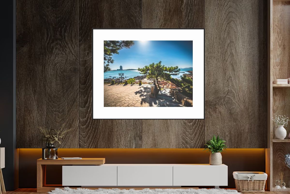
This award-winning piece from North America demonstrates perfect sofa placement—large horizontal format (48-60 inches) creates proper proportion above sofas, typically 60-75% of sofa width.
Sofa Width Guidelines
Standard Sofa (72-84 inches / 6-7 feet):
- Artwork width: 48-60 inches
- Single large piece or diptych
- Horizontal orientation works best
Large Sofa (84-96 inches / 7-8 feet):
- Artwork width: 60-72 inches
- Large single piece or triptych
- Can accommodate very large landscapes
Sectional Sofas:
- For the main section: 60-75% of that section's width
- Can use multiple pieces or one very large piece
- Consider the overall L-shape when planning
Small Sofa (60-72 inches / 5-6 feet):
- Artwork width: 36-48 inches
- Single piece or smaller diptych
- Don't go too small—maintain presence
Height Above Sofa
Standard Placement:
- Bottom edge of art: 6-12 inches above sofa back
- Center of art: Approximately 60-66 inches from floor
- For very tall sofas: Can position art higher, but maintain relationship
Visual Relationship:
- Art and sofa should feel connected
- Too much space creates disconnect
- Too little space feels cramped
- 6-12 inches is the sweet spot
Orientation
Horizontal Landscapes:
- Work best above sofas
- Match the horizontal line of the furniture
- Create width and balance
- Most common choice
Vertical Landscapes:
- Can work for narrow sofas
- Create height and drama
- Less common but can be striking
- Consider if sofa is against a tall wall
Multiple Pieces:
- Diptych: Two pieces side-by-side
- Triptych: Three pieces (can be horizontal or vertical)
- Gallery wall: 3-5 pieces in a curated arrangement
- Total width should still be 60-75% of sofa width
Above the Bed
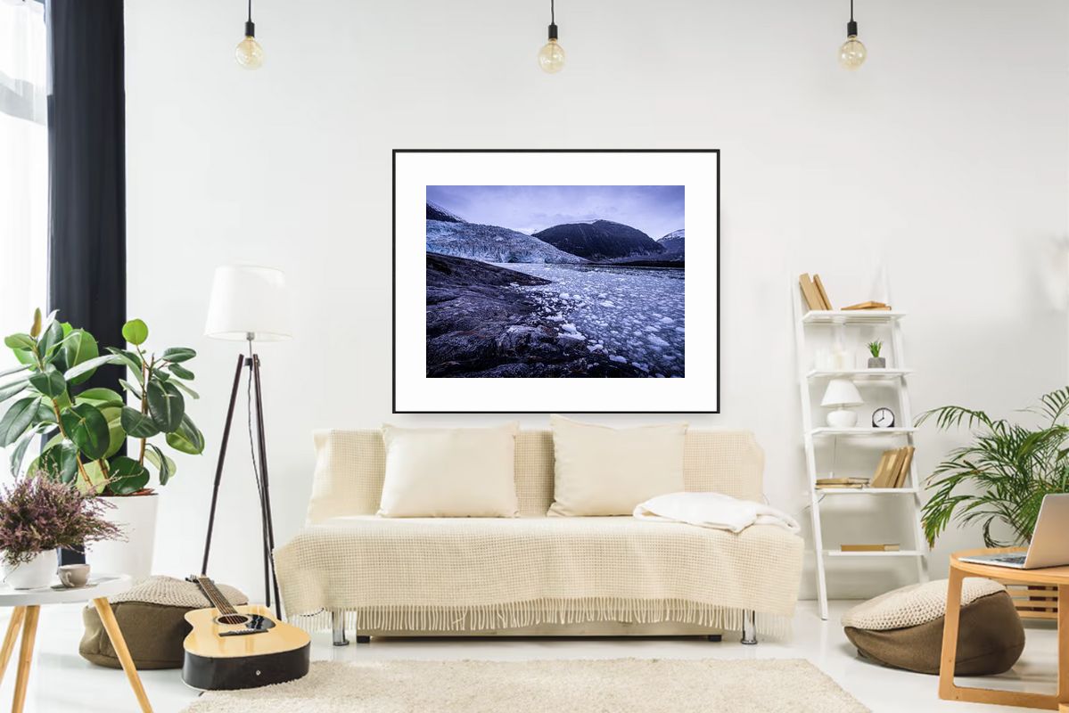
This award-winning piece from South America demonstrates perfect bed placement—appropriate scale creates proper proportion above beds, typically 60-75% of bed width for king beds.
Bed Width Guidelines
King Bed (76 inches / 6.3 feet):
- Artwork width: 48-60 inches
- Large single horizontal piece
- Or vertical arrangement of 2-3 pieces
Queen Bed (60 inches / 5 feet):
- Artwork width: 36-48 inches
- Single piece or diptych
- Horizontal orientation typical
Full/Double Bed (54 inches / 4.5 feet):
- Artwork width: 32-40 inches
- Single piece works best
- Can be horizontal or vertical
California King (72 inches / 6 feet):
- Artwork width: 48-54 inches
- Similar to standard king
- Large single piece or arrangement
Height Above Bed
Standard Placement:
- Bottom edge: 6-12 inches above headboard
- Center: Approximately 60-66 inches from floor
- For low headboards: Art can be larger and positioned higher
- For tall headboards: Art should relate to headboard height
Headboard Considerations:
- Tall upholstered headboards: Art can be smaller, positioned in upper third
- Low platform beds: Art becomes the main focal point, can be larger
- No headboard: Art is the primary element, center at eye level
- Wooden headboards: Consider color and texture relationship
Orientation
Horizontal Landscapes:
- Most common above beds
- Match bed width
- Create calm, peaceful feeling
- Work with most headboard styles
Vertical Landscapes:
- Can work for narrow beds or tall walls
- Create height and drama
- Less common but can be striking
- Consider if you have high ceilings
Multiple Pieces:
- Diptych: Two pieces side-by-side
- Triptych: Three pieces horizontally
- Vertical stack: 2-3 pieces arranged vertically
- Total width should be 60-75% of bed width
Measuring Your Space
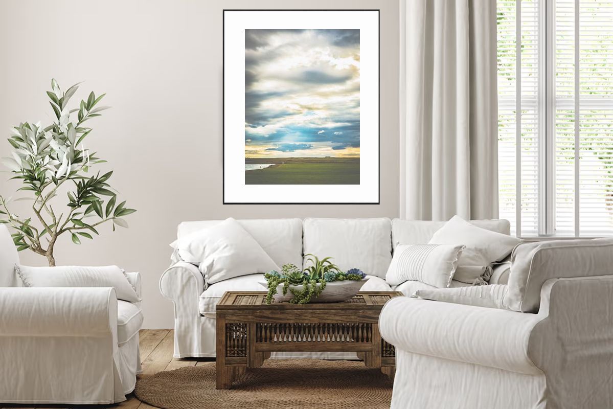
This award-winning piece from Africa demonstrates proper measuring—large scale artwork that fills space appropriately, creating visual balance with furniture.
Step-by-Step Process
- Measure Furniture Width:
- Sofa: Measure the widest part (usually the back)
- Bed: Measure the width of the mattress/headboard
- Calculate Art Size:
- Multiply furniture width by 0.6 (60%) for minimum
- Multiply furniture width by 0.75 (75%) for maximum
- This gives you your ideal art width range
- Consider Wall Space:
- Measure available wall space
- Ensure art fits with proper spacing
- Leave 6-12 inches on each side minimum
- Account for Frames:
- Frame adds to overall dimensions
- Measure art + frame, not just art
- Consider if using multiple pieces with spacing
Example Calculations
84-inch Sofa:
- Minimum: 84 × 0.6 = 50.4 inches
- Maximum: 84 × 0.75 = 63 inches
- Ideal range: 50-63 inches wide
60-inch Queen Bed:
- Minimum: 60 × 0.6 = 36 inches
- Maximum: 60 × 0.75 = 45 inches
- Ideal range: 36-45 inches wide
Common Sizing Mistakes
Too Small
The Problem:
- Art looks lost and insignificant
- Doesn't create proper focal point
- Room feels unbalanced
- Furniture overwhelms the art
The Solution:
- Go larger, even if it feels big at first
- Better to err on the side of too large than too small
- Art should have presence and impact
Too Large
The Problem:
- Art overwhelms the furniture
- Room feels cramped
- Art and furniture compete
- Lacks visual balance
The Solution:
- Scale down to 60-75% range
- Consider multiple smaller pieces instead
- Ensure proper spacing from walls
Wrong Height
The Problem:
- Art too high: Disconnected from furniture
- Art too low: Feels cramped, awkward
- No visual relationship between art and furniture
The Solution:
- Maintain 6-12 inches above furniture
- Center at eye level (57-60 inches)
- Art and furniture should feel connected
Special Considerations
High Ceilings
With high ceilings (10+ feet):
- Can go larger (up to 80% of furniture width)
- Art can be positioned higher
- Vertical pieces work well
- Multiple pieces in vertical arrangements
Low Ceilings
With low ceilings (8 feet or less):
- Stick to 60-75% range
- Horizontal pieces work best
- Keep art lower, closer to furniture
- Avoid vertical arrangements
Narrow Walls
For narrow wall spaces:
- May need to adjust proportions
- Vertical pieces can work
- Consider art that's slightly narrower
- Ensure proper side spacing
Wide Open Walls
For large, open walls:
- Can accommodate larger art
- Multiple pieces work well
- Gallery arrangements possible
- Don't be afraid to go big
Framing Considerations
Frame Size
Frame width affects overall dimensions:
- Thin frames (1 inch): Add 2 inches total (1 inch each side)
- Medium frames (2 inches): Add 4 inches total
- Wide frames (3+ inches): Add 6+ inches total
Calculate: Art size + frame width = Total size
Multiple Pieces
When using multiple pieces:
- Include spacing between pieces in total width
- Typical spacing: 2-4 inches between pieces
- Total arrangement should be 60-75% of furniture width
Conclusion
The right size artwork above sofas and beds:
- Is 60-75% of the furniture width
- Is positioned 6-12 inches above the furniture
- Creates visual balance and connection
- Has proper presence without overwhelming
- Accounts for frames and spacing
Remember, these are guidelines, not strict rules. Room context, ceiling height, and personal preference all matter. But following these proportions will give you a solid foundation for creating beautifully balanced spaces. When in doubt, err on the side of slightly larger—art that's too small is a much more common mistake than art that's too large.